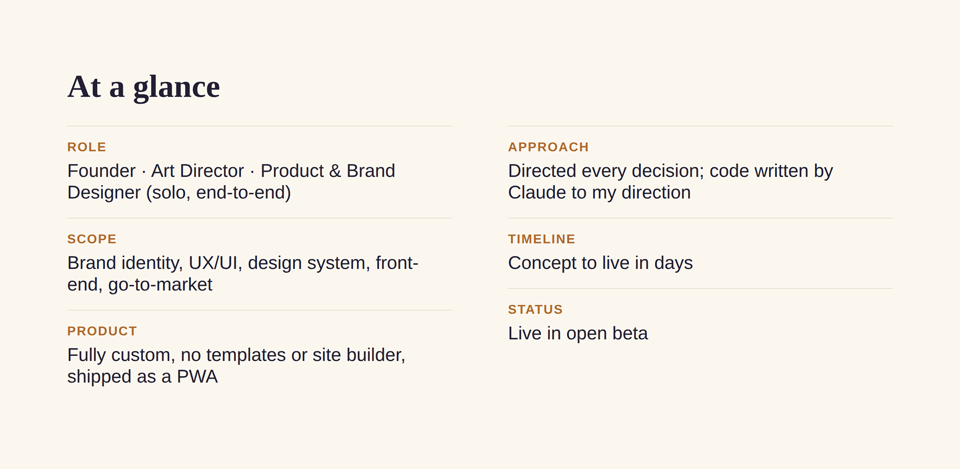
A gentle to-do app for neurodivergent kids. Designed, branded, and shipped end to end, solo.
0 to 1 product design · brand identity · UX/UI · design system · go-to-market.
Some kids feel like “just brush your teeth” is ten steps, not one.
For a lot of neurodivergent kids, the everyday must-dos don’t feel simple. Existing chore apps lean transactional and over-gamified, adding pressure and sensory overload.
The opportunity
Help kids get through the hard stuff and feel proud of it, and know it’s okay to find it hard. Not productivity software for children. Emotional design for executive function.
Three strategic pillars shaped every product, brand, and business decision.
Gentle, not gamified into pressure.
Celebration is the reward, never competition or punishing streaks.
Sensory-aware and inclusive.
What delights one kid overwhelms another, so the experience flexes to each.
Private and frictionless.
No accounts, no logins, no tracking. Everything lives on the device.
Warm over slick. Human over clinical.
Hand-drawn logomark.
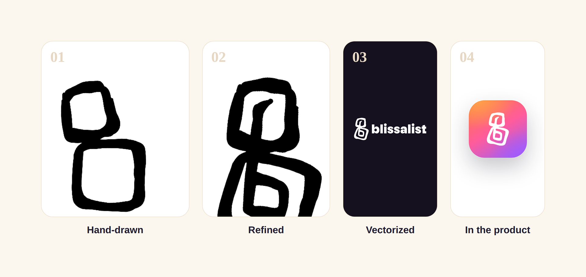
A lowercase b from two stacked blocks, reads as b, as balance, as adult + child.
Signature sunset system.
Orange to pink to purple, full light and dark mode, WCAG AA contrast throughout.
Expressive and readable type.
A warm display face paired with a clean, human body voice.
Plain-spoken, kind voice.
“It’s okay to hate to-dos.” No jargon. No shame.
From a hand-drawn spark to a system.
The mark never lost its human origin.
It just grew into something that scales: hand-drawn spark, refined by hand, vectorized into a system, then living on the sunset app icon.
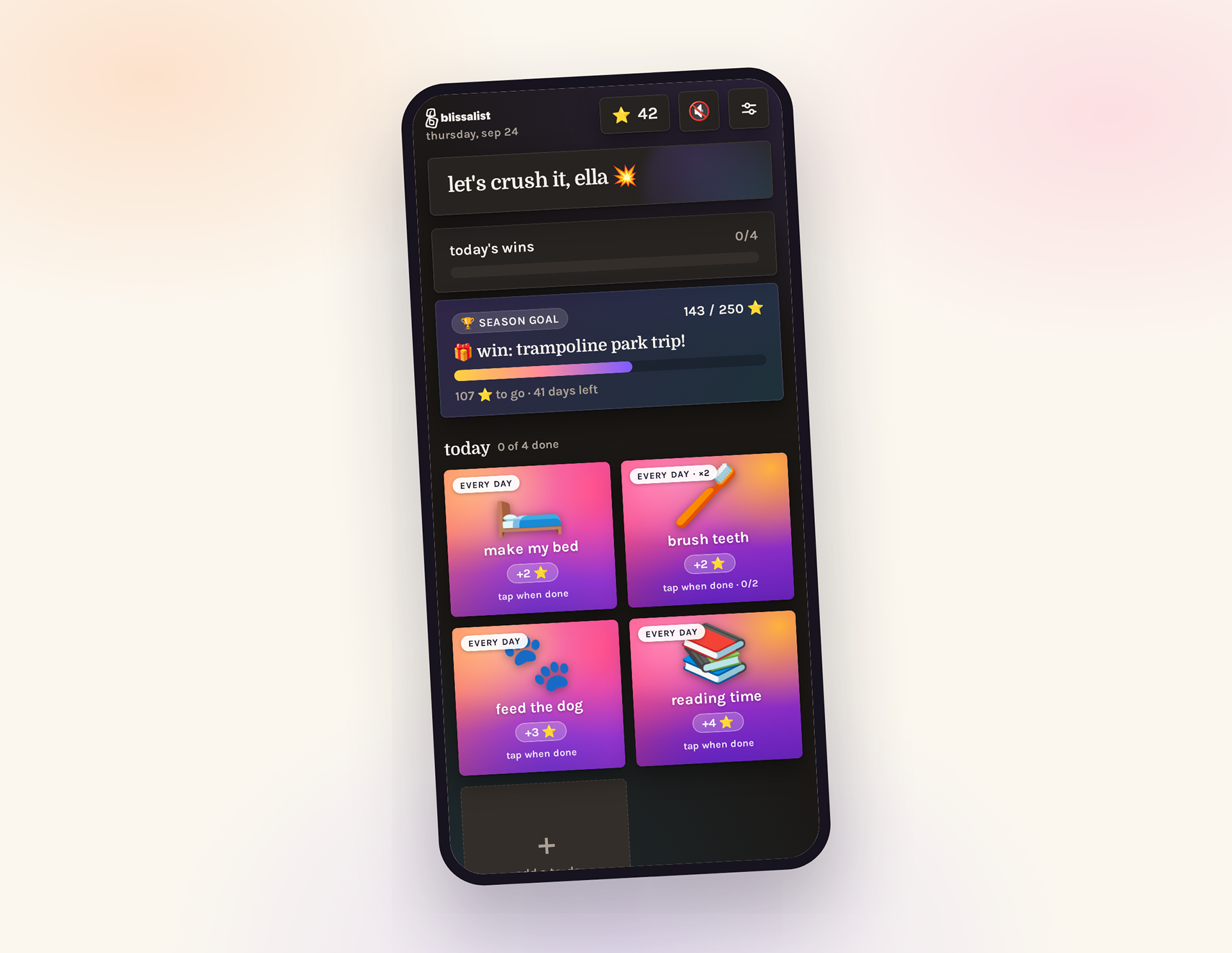
Tap a to-do, earn a star, celebrate.
Rewards you choose.
Stars ladder up to real, parent-set rewards.
Made for how brains work.
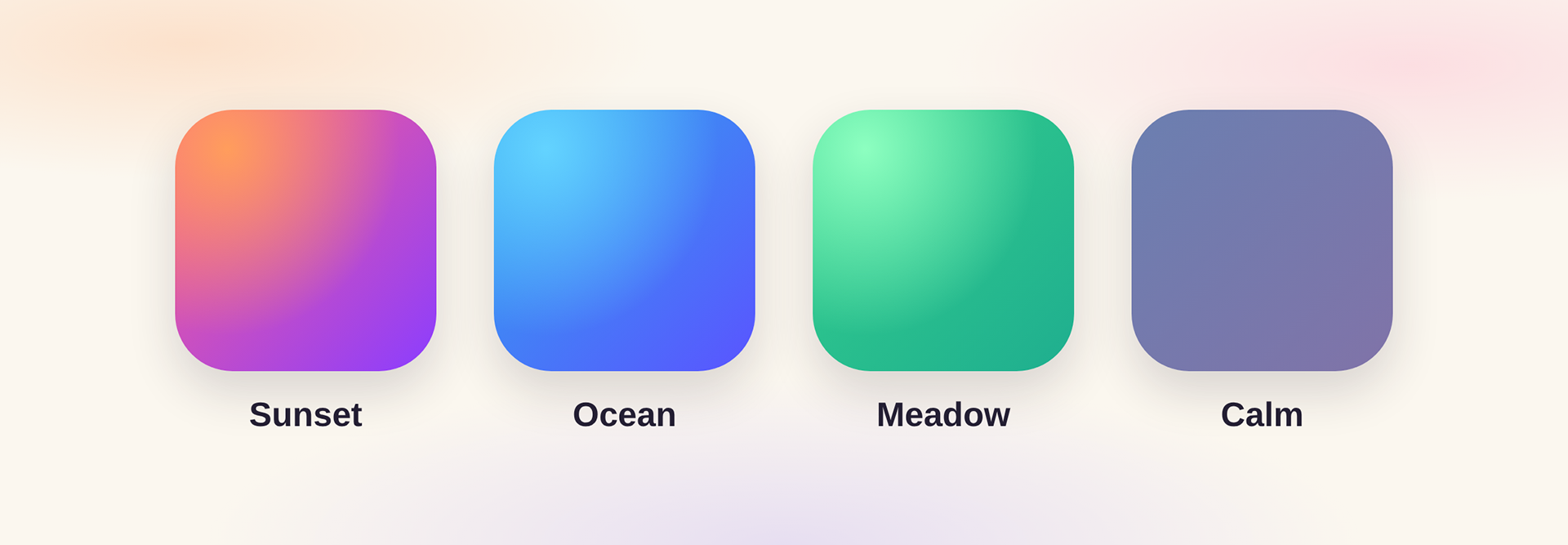
Each kid picks their palette and can turn celebrations all the way off.
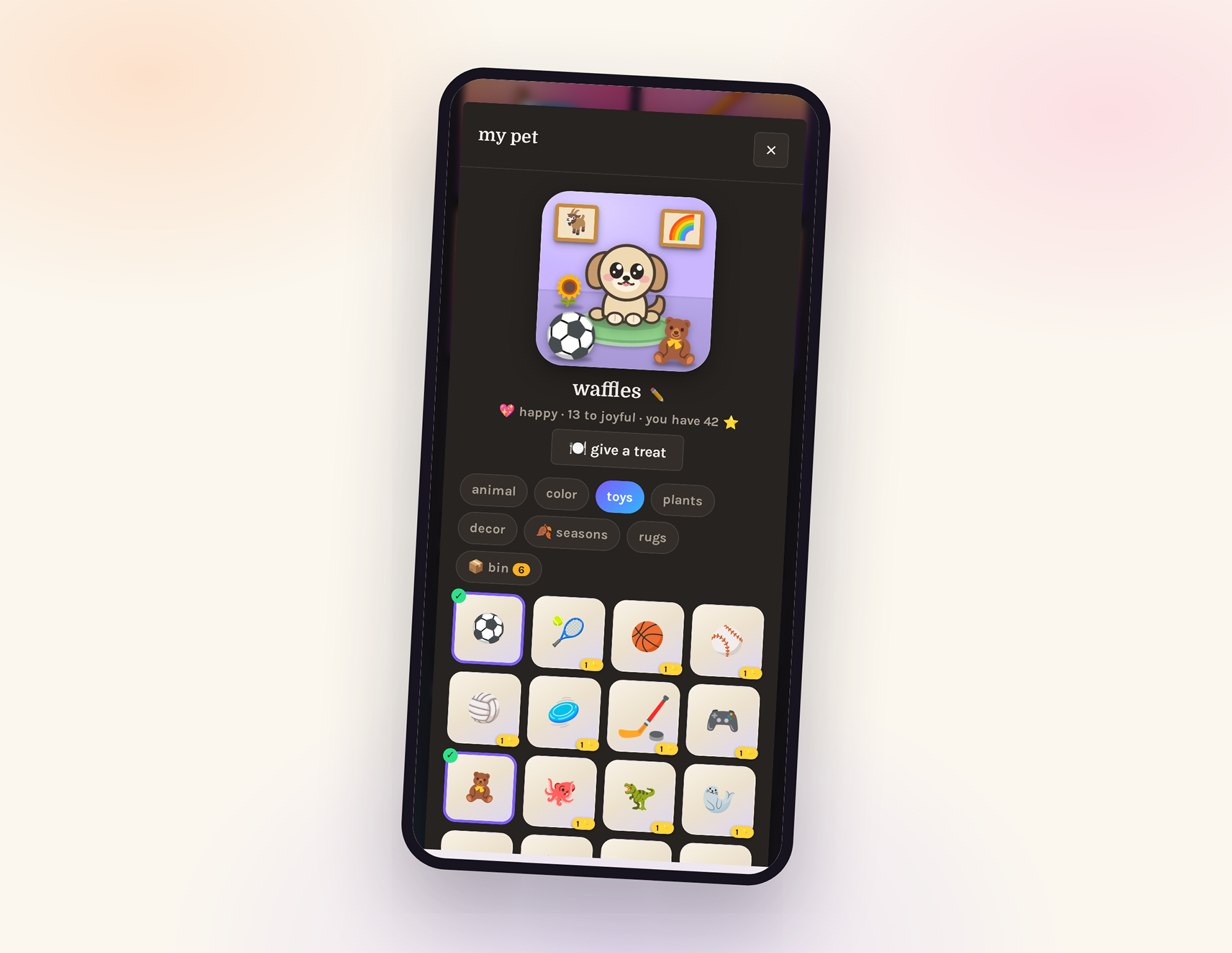
A collectible pet.
A warm feel-good extra, never the main event.
Private by design. No logins. Everything stays on the device.
Private by design. No logins. Everything stays on the device.
Designing for sensory difference, not around it.
The trap
One bright look for every kid, overwhelming for some.
The decision
Each kid picks their own palette, plus a full celebrations-off switch. Inclusive, sensory-aware design as a first-class feature, not a buried setting.
Directed, not templated.
No site builder, no template, no drag-and-drop.
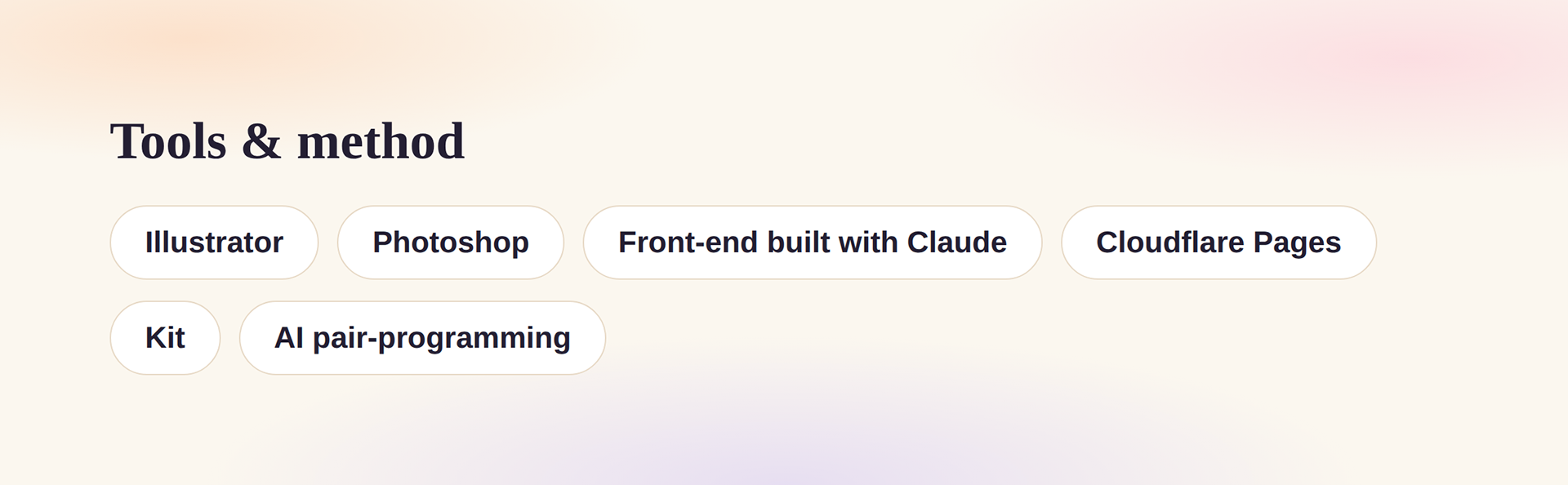
Blissalist is a fully custom product: a designed component system, an installable PWA that updates itself silently, light and dark theming, and offline-first architecture.
I directed the entire build, every design, UX, copy, motion, and engineering decision, with Claude writing the code to my direction. A senior creative carrying a whole product to ship, not just handing off screens.
I designed the launch, not just the product.
Conversion landing page with a live beta funnel wired to comms.
Social launch system
Instagram, a month of planned content, reel scripts and shot lists, creator outreach.
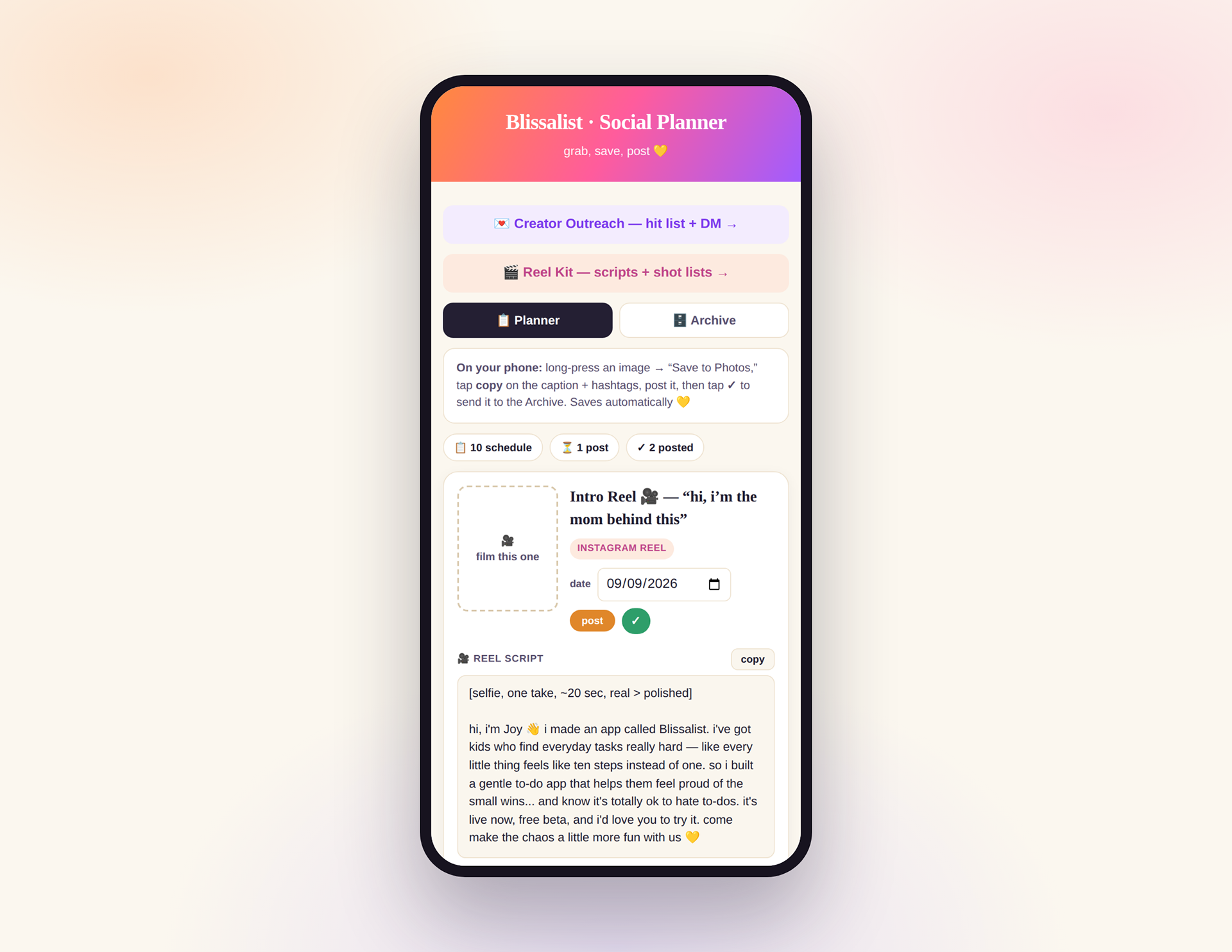
Custom content planner (my own tool)
Schedule, track, and archive every post.
One visual language
App to icon to email to social, every touchpoint on-brand.
From a feeling in my gut to a live, self-sustaining product.
Brand, app, email, funnel, and content engine, launched publicly and open to its first users.
Next
A fully custom-illustrated pet system, depth and motion across marketing, and a growing beta crew ahead of paid launch.
What connects everything I make
Take something ordinary and easy to overlook, and make it feel like it matters. With Blissalist, that meant helping kids feel proud of the small, secretly-hard wins, and carrying one idea from insight to a shipped product, end to end.